Responsive web design is very popular now a days and to be honest we can not ignore responsive design anymore. If you are building a website it must be responsive and mobile friendly. Because now more and more people are using small screen devices (smart phones, tablets, note books etc) to browse their favorite websites, blogs and social networking websites.
There are many reasons to choose Responsive design, because responsive design solves many problems
- One code base, one deployment One URL
- All content is available everywhere (phones, tablets, computers)
- Responsive design is Future Friendly
With responsive design your content is available on all devices, you don’t need to create and manage separate mobile website for small screen devices. One URL also avoids duplicate content which can hurt SEO.
Google also highly recommends Responsive web design over separate mobile websites. There are so many tools and frameworks available to create responsive websites.
But responsive webdesign does not solve all the problems, some problems also exists with responsive design such as responsive images. With HTML and CSS you can resize your images but if you have large images it won’t solve the issue.
Fluid images are not best solution. Just because an image scales down on a narrower screen does not mean that it is not still, at heart, a large image. A 2 MB JPEG is still a 2 MB JPEG, even if it’s crammed down into a 120-pixel-wide column.
High resolution images are enjoying greater popularity with the advent of retina displays and loading high-resolution images can eat up quite a bit of bandwidth. So, if you can serve up a lower-resolution image when you are viewing your site on a mobile device, browsing speeds up considerably.
Let’s suppose you have a large 2MB image, While this may not make a lot of difference when browsing on your desktop over a fast broadband network, it can make for an achingly slow website when surfing over slow mobile network on a mobile phone. It will take too much time to load an image.
What is RESS: Responsive Design + Server Side Components
RESS can help you to optimize your content for small and large screen devices. You don’t need to create a separate website for small screen devices. You can use server side swapping to display different content. For example for small screen devices you can display small image while for large screen devices you can display large high resolution image.
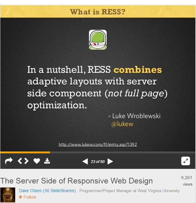
In 2011 Luke Wroblewski published an article RESS: Responsive Design + Server Side Components in which he explained the concept of RESS: Responsive Design + Server Side Components in detail. Here is an excerpt from Luke’s article about RESS.
How’s RESS: Responsive Design + Server Side Components Work?
Let’s assume we want a different navigation solution for mobile and desktop devices. Because screens are small on mobile, we want a minimal header that doesn’t take space away from content. But we need to allow people to navigate the site in a comfortable way so we’ll position the navigation links at the bottom of the page where accessing them tends to be easier with one-handed use.
On the desktop, however, we want the same navigation at the top of the page. There’s plenty of room for the content and we can expose all our menu choices to give people a sense of what’s on the site. You can see the difference between these two navigation designs below.
You should read this article for more details. One important question that you can ask is RESS approach really effective? Luke also answered this question in his article, Luke actually used this device specific components in the implementation of his start-up, Bagcheck blog.
In above case their server side components took care of optimized rendering for specific devices. Luke believes that Relying on user agent detection on the server to decide which device class specific components to include could be an issue for some. Because there was a lot of debate about how accurate user agent detection is.
Getting started tutorials and tools
If you want to learn more about RESS and how to get started with RESS (Responsive Design + Server Side Components) here is a list of some awesome tutorials and resources published on some authority blogs such as Smashing Magazine and CreativeBlog.
RESS: Responsive Design + Server Side Components
This article was published in 2011 by Luke Wroblewski. This is a must read article to understand the basic concept of Responsive Design + Server Side Components.
This tutorial is written by Anders M Andersen for CreativeBlog. Basic knowledge of PHP and Responsive design is required.
Lightening Your Responsive Website Design With RESS : Tutorial
Improve Mobile Support With Server-Side-Enhanced Responsive Design : Case Study
Above tutorial and case study were published on SmashingMagzine in 2013.
Tools
RESS.io is a tool for elite web designers & developers to implement RESS easily and effectively, based on LukeW‘s Responsive Design with Server Side components model. To learn more about visit getting started page.
Detector is a simple, PHP- and JavaScript-based browser- and feature-detection library that can adapt to new devices & browsers on its own without the need to pull from a central database of browser information. You can visit github page to see demo and learn more about Detector.
Leave a Reply